Pieter Mathys
In a previous article we looked at what next-gen image formats are, and what the benefits are. But how do you implement them in a Drupal website? There are a number of different options:
Before getting started, we took a quick look at how these modules work.

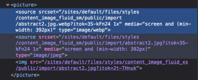
Then clear the caches of your drupal website. From then on the .webp variations would become available in each <picture> element.
This module (which we already use by default since it is more performant than GD) allows to perform a WebP conversion on an image-style. This means that you have to create custom image-styles for each variant where you want to use WebP. Also with the responsive image-styles you then have to select multiple image-styles per breakpoint (the regular and webp version).
Unfortunately, this quickly adds up to a lot of work. Since we are using the responsive images module, we quickly create 5 variants (sm, md, lg, xl, thumbnail) for a simple teaser image. In some cases, even more styles are needed. In short, you double the work. For this reason we decided not to use this solution.
This module is actually quite simple:
"Whenever an image style derivative is created this module will also create a WebP copy of the derivative to be served to supporting browsers."
So, every time an image-style is created, this module automatically creates a webp variant. This solution seemed very useful to us, since it simply creates the desired variations automatically. However, we couldn't get this module to work on our docker-based setup. For some reason this module does not play well with the imagemagick module. And it is just that imagemagick module that we want to continue using.
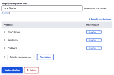
Since we already use the imageapi_optimize module, it was obvious to include this module. The imageapi_optimize module allows us to create "pipelines", where we can link different operations (so-called processors). We thus make use of the JpegOptim and PngQuant processors. Both processor libraries aim at removing unnecessary (meta) information from the original images. This results in smaller images.
This module adds an extra processor: WebP deriver. This processor creates a .webp variant of each image handled by this pipeline. So you just need to install the module(s), and create (or modify) the pipeline so that it uses this WebP deriver. Afterwards you need to set up this pipeline for all image styles.
I probably shouldn't tell you that developers are lazy creatures. 😉 If we can do something simple: why not? As long as it works well!
So we tested the above options extensively. In some cases it turned out to be a lot of additional work (imagemagick module). In other cases we just couldn't get it to work in our docker setup (webp module).
We are extremely satisfied with one solution: via the imageoptimize api we can offer the webp format with limited modifications. For these reasons, we have decided to further develop this solution in our DXP.
If you want to get started yourself, you can follow the following generic step-by-step plan:
There are only a few requirements:


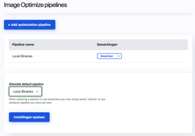
When creating the pipeline, you can also set this pipeline as the default in one move. All created image styles will then use this pipeline (unless another pipeline is assigned).

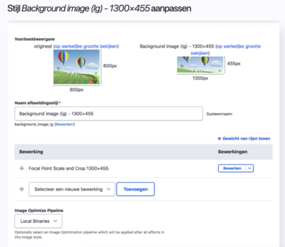
You can choose a pipeline per image style. Go through all image-styles and complete the appropriate pipeline.