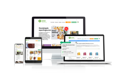
Oxfam was looking for a reliable partner for their website. The Oxfam website actually consists of 2 separate websites: the website and the web store. We optimized the user experience of the webshop by reworking the flow and taking over the look & feel of the general site. For the webshop you always have to choose a physical store. Each store has its own assortment. A store in Mechelen does not necessarily have the same stock as an Oxfam store in Ghent.

A reliable website partner for this well-known NGO
Oxfam works to provide concrete and innovative solutions to vulnerable people around the world. Solutions that enable everyone to get out of poverty and reach their full potential. In times of conflict or disaster, they save lives and help those affected regain their livelihoods. They campaign to include the voices of poor people in local and international decisions that affect them in their daily lives. Oxfam has more than 200 staff spread across its headquarters in Brussels and in its second-hand stores and nearly 1,500 volunteers. Oxfam implements development projects and programs in more than 90 countries around the world. Oxfam-Wereldwinkels offers the widest range of fair trade products in Belgium. With your purchase you also support a volunteer movement that strives for structural change in the trade system.

The problem statement of their old webshop
Upon visiting the web store, you were immediately confronted with a screen to choose your store. Your entire computer screen filled with a google map with hundreds of markers on it. On the left you saw a small list of stores. Based on the zip code you could search through this list. This scared off many visitors, the mandatory choice of a store created a barrier. Website visitors want to be able to view the products first before they have to make such a choice.
The proposal
Our User Experience experts suggested moving the selection of the store a few stages. This way, you can first calmly view the products before proceeding to order. Furthermore, they suggested to better align the visual style of the main website and the web store.

From plan to action
Oxfam accepted both proposals, but feared that they could not rework everything in time. Given the sensitivity in time, this all had to be done quickly. They only have one developer, and quite a lot of work had to be done. Calibrate was able to step in. One of our developers worked closely with the Oxfam development team for 2 weeks. The tasks were divided given the specialties of both developers.
Because of the technical complexity of both sites it was very difficult to get everything ready in time, but the deadlines of Oxfam were met. With a few compromises.
For example, the mobile part is not yet optimal. In the next phase we will work together again to strongly improve the mobile version on the one hand, and on the other hand to apply an updated look & feel. So that the site looks like new again.
Did you know?
Our User Experience experts are called UXMen? They are part of the Calibrate Group and work specifically on user-friendly online experiences that get results.
