Thomas De Vriese
As a front-end developer, you are constantly looking for ways to work more efficiently and improve the visitor's user experience. One way to achieve this is by using CSS logical properties and values. These properties not only provide a more intuitive way to style elements, they also contribute to better code formatting and also add value to the user.
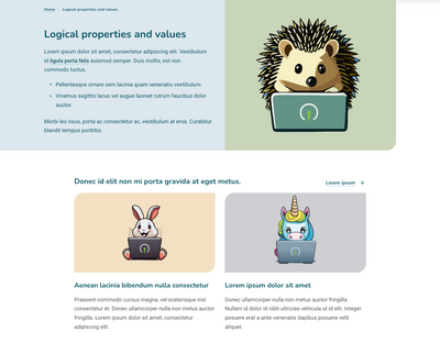
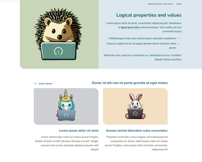
One of the biggest advantages of CSS logical properties is that they adapt to different writing and reading directions. Instead of using specific properties for left-to-right (LTR) and right-to-left (RTL) languages, logical axes are now automatically adjusted. Content with "text-align: start" will align left in an LTR language, and with the same code, this text will align right in an RTL language.
Instead of relying on physical directions, the logic automatically adapts to the user's context. Regardless of language or text direction, this ensures a consistent appearance and clear, easy-to-maintain code.
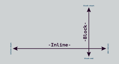
Traditionally, we define the dimensions of elements on a Web site with physical properties. For example, they have a height and width or we can position elements from top to bottom and left to right. But margins, padding, border-radius and alignment are also determined with physical properties. With CSS Logical properties and values, we link the orientation of elements to two logical axes.

The axis of reading direction is the "inline" axis and on it is the "block" axis. Each axis has a "start" and an "end" point.
For example, "width" now becomes "inline-size", "height" becomes "block-size",and "padding-top" becomes "padding-block-start".
Websites are evolving and increasingly targeting a global audience. With a growing demand for multilingual and international websites, the use of "logical properties and values" is essential. By adjusting the "dir" attribute, the layout will adapt to the reading direction. Additional adjustments after translation to an RTL language will remain limited.
<html dir=”ltr”>
<html dir=”rtl”>
The "dir" attribute informs browsers that content should be displayed in either LTR or RTL mode. This attribute was also previously used to adjust the specific styling for RTL for each CSS class.
.quote {
  margin-left: 1rem; /* LTR */
}

[dir="rtl"] .quote {
  margin-left: 0;
  margin-right 1rem; /* RTL*/
}
.quote {
  margin-inline-start: 1rem;
}
/* height: 1rem; */
block-size: 1rem;

/* max-width: 1rem; */
max-inline-size: 1rem;

/* text-align: right; */
text-align: end;

/* right: 1rem; */
inset-inline-end: 1rem;

/* border-bottom-width: 1rem; */
border-block-end-width: 1rem;

/* padding-left: 1rem; */
padding-inline-start: 1rem;

/* border-top-right-radius: 1rem; */
border-start-end-radius: 1rem;

:where(.breadcrumbs, .pager):dir(ltr) svg {
  scale: -1 1;
}Using "logical properties and values" offers numerous benefits to developers, ranging from flexibility and ease of maintenance to improved international support and future-proofing. By embracing this approach, you can work more efficiently and deliver high-quality Web experiences to a global audience.