Yannick Nijs
When designing or drawing up a website, a problem quickly arises concerning the concept of 'scrolling': something that is indispensable in the web world. Is the visitor scrolling on the website or not?
The terms 'the fold' or 'above the fold' are also known values in the web world. They are terms borrowed from the world of print. If we talk about terms that are specific to the world of print, can we just adopt them and implement them on the internet? What exactly is the fold? And when we talk about 'above the fold', what about 'below the fold'?
In our research a lot of extra questions arise that are closely related to the question whether the average surfer is scrolling or not. But perhaps we should start at the beginning:

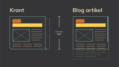
We have already mentioned it above. The fold comes from the world of printing, more specifically the world of newspapers. If we fold a newspaper in two, we get a visible part and an invisible part of the page. It is that visible part that we call 'the fold'. Above the fold means that part of the website that is visible without scrolling. Below the fold is the part of the website that is not visible without scrolling. So you have to scroll to see this part of the website.
With the fold in the web/digital world, we mean the content we can see on the screen without taking any scrolling action. So far not much different from the newspaper world. The challenge only comes when not one fold, but several folds have to be made, this from the same page with exactly the same content. Multiple folds do we hear your questions? Yes, we do. Since the advent of mobile devices and the great variety of monitors, we must at least tune our folds to the most common screens and the resolutions associated with them.
Why so much care in the layout of our fold? Quite simply. It is the only chance to attract our potential readers' attention and motivate them to read and/or convert the rest of the page.
A time and cost consuming task, but is it still worth it?

The answer is undoubtedly 'Yes! The fold is still very important and up to date. It is and always will be the first and only part that visitors get to see when they visit your website. It therefore seems illogical to us to claim that the fold wouldn't work. There are also plenty of articles, studies and blog posts (see below) that show the importance of the fold and we cannot just ignore that.
Well, we are now convinced that the fold is important, but we are not so sure yet that our visitors are scrolling.
In order not to distract them, we make sure that only the most necessary but most important information is in the fold. Is it sufficient to show a catchy title, a short text and a striking call-to-action (= CTA) on a beautiful and atmospheric background image?
In some cases, that will suffice. Just think of websites from which you can download software (see image above). They mainly want you to download and use their software as soon as possible. And frankly, if we want to download software, we prefer nothing more than a single button immediately on the homepage that takes us to a download page. Better still, a download link that automatically detects our OS (operating system) and immediately starts the correct download.
Wonderful! We have the solution. From now on, we place all our call-to-actions at the top of the fold by default. In this way, all users can see with certainty our cta's and we get our conversions! Everybody happy! ... Or not?
Unfortunately, that's not how it works. Tests show that a call-to-action at the top of the page does not always work optimally. In some cases it is even better to place the call-to-actions after your article or story. Why should I do this? If the user is presented with a CTA without any explanation, he will not feel the need to click on it. Which also seems logical to us. Imagine, you are visiting a website where all you are presented with is a button with on it: 'Book now' or 'Donate'. Nobody will feel the need to click this button simply because we don't know why we should book now or what we should donate for.
That is obvious. But what if we post our call-to-action, or the continuation of our article, 'below the fold', will our users still follow? Or in other words:

Here, too, the answer is 'Yes, but ...'. Users don't scroll because they are used to it or because they like to scroll. No, they scroll because we give them a reason to. There are countless ways to get visitors 'below the fold', only they need to be clear and convincing enough for them.
Visual elements can lead the visitor's attention downwards. Even content that is already partly visible can motivate a user to scroll further. In addition, the less subtle 'read more'-button at the bottom of the fold can also do its bit to make the visitor scroll. Here are a few tips:
1. Avoid the false bottom or false floor. This mistake can be made faster on a website with less content. By placing images over the entire screen and not creating any extra triggers under the fold, it may appear that nothing at all follows under the fold. In such a case, you run the risk that your user will not see the full story and will leave your website in the worst case.
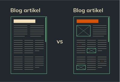
2. Think carefully about how to write content/texts. This is how the term long-form content is becoming more and more popular. In short, this means that authors are moving away from texts around 500-800 words. How many words a long-form content should have is not really determined. It would also be diametrically opposed to the concept of long-form content. However, in order to be able to sketch it somewhere, one starts from articles with more than 1200 words. There are even articles that contain up to 10,000 words and are anything but bad. On blogsites we see that readers prefer 'the more bulky' texts over the previously synthesized ones and search engines are more fans of this. Something you can only be happy about as an author. You can tell more and go into even more detail.

3. Make sure that texts remain interesting. Not only in terms of content, but also keep them visually attractive and airy. Make sure that the user doesn't get into zombie mode, but is occasionally stimulated by something that can rekindle his attention and give him renewed energy to continue.
The leading blogs, UX/UI designers or content strategists offer us tons of information, figures on how to build pages/folds and write content. How to get better brand recognition or how to score better in search engines.
But we have to be realistic. All the solutions we are offered have been preceded by good research. A research that must be the basis of the basis: ‘Who is my visitor and what are they looking for?’. The cliché, but as long as we don't know who our target audience is, as long as we don't know what they are looking for or what they need, we can't define a strategy to keep them on our website for a longer period of time.
Do our users scroll? Yes, they do! With pleasure. Provided we give them what they want. So don't just assume that you know your readers, but get to know them. Research in different ways who they are, what they do and especially what they are looking for. Keep doing this during the project and not just at the start.
Some interesting articles
https://conversionxl.com/blog/above-the-fold/
https://www.nngroup.com/articles/page-fold-manifesto/
https://www.pixelfire.com.au/5-reasons-why-the-fold-is-absolutely-irrelevant-in-modern-website-design/